

Some of these outcomes cover reports and dashboards. I have built and seen many dashboards that don’t make the mark. We have the best of intentions, however, something may be missing which impacts the delivery of a report or a dashboard to the business and is likely to waste time.
I want to share some of my experiences and I would love to hear yours as well, with examples, even better 👍!
The Bad
The above screenshot is one example of a dashboard, that would have taken many months to put together. It does suffer from a couple of things that take away from the user experience.
- There are many numbers that are large and bold. These indicate KPI’s, however, it is difficult to see which KPI’s are important. There is also a separation of large numbers on the top, horizontally, and by quadrant. This dilutes the impact.
- More than one KPI is combined with a range of segmented charts. It is difficult to know which KPI is associated with the chart. A wrong conclusion could be made.
- There is way too much information being presented. If this is an executive-level dashboard, I would consider splitting this into multiple views, with a more clear front cover.
- The wording under each KPI, and in between sections is difficult to read. I would hesitate at using small font sizes for heading or key labels.
- A variety of chart types have been included on the one page. This creates some noise and interpretation from the user. Consider using a consistent chart type.
- Consider giving the KPI’s some context. Was this an increase or decrease in the last report period? Is this above or below agreed targets?
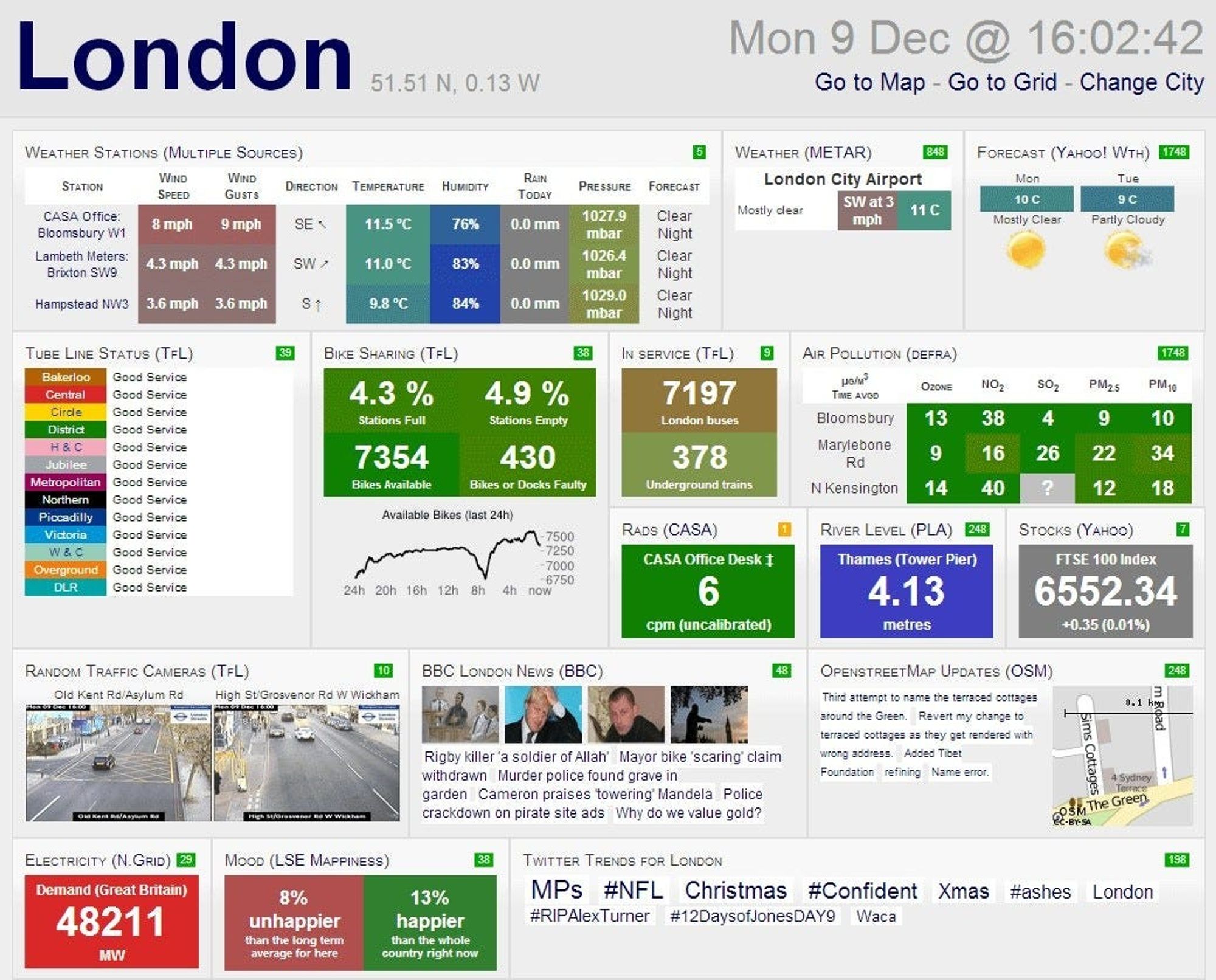
Here are some other examples;
Keep it simple; 3D charts can be misleading, and create unnecessary noise.
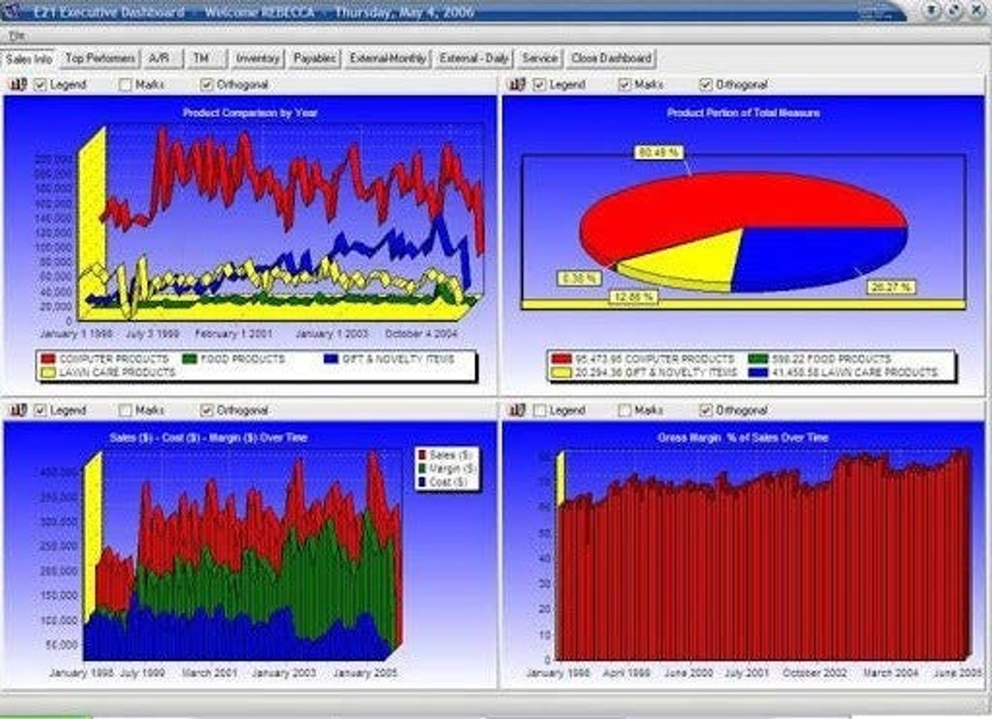
Consistency: Use similar chart types. It is often unnecessary to use a variety;

Context: Each view should have a purpose or a decision that can be made. If you have a lot of information to present, consider using a storyboard to segment these into different views.
What are your takes on this? Do you have other examples? Keen to hear more.
I hope you found this useful. I will be posting regularly so stay tuned. If you want additional content, check out Analytics Roundtable, to stay up to date with the latest technology and chat with others.