
Your team will require a few different skills to optimise the impact and frequency of workforce insights. To start you may be able to partner an experienced HR business partner with someone who can source and analyse data to question and shape relevant insights. This can be effective as you can quickly identify what is important, build a business case for additional resources and potentially start the project with a quick win that will allow you to spend additional time with key stakeholders.
At some point you may reach a bottleneck where you have squeezed the sponge dry in a sense and it may be difficult to find new insights or your team get stuck into regular reporting around what has previously worked, only to find that the reports are not adding any insight further down the track or they do not go deep enough to shed light onto the issues.
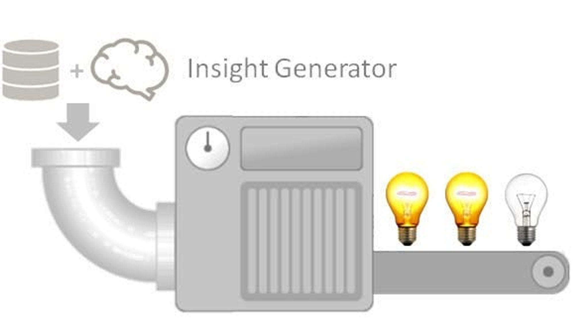
Here are my tips for building a great analytics pipeline that should start to show value incrementally.
1. Stop dashboards with typical HR metrics. Reports or dashboards with measures like attrition rates by line of business or recruitment metrics like time to fill can often lead to misinterpretation or hide core organisational issues as they are either too high in level or are not coupled with the right context. If placed out of context, time to fill can have a negative impact on the quality of the hire impacting new starter retention, lowering productivity/revenue or creating higher risk / lowering brand reputation.
Worst case, you create disengagement and a loss of interest to use data to help inform some of the most important decisions an organisation can make around its staff and you usually only get one shot with a stakeholder.
Most people reporting outputs fall into two categories; reporting or insights with a recommendation to action. You should have the reporting aspect automated and centralised to ensure standard definitions and understanding. Within this, you should know who your customers. The best way to start creating insights is by working on specific business problems through sprint programs lasting between four to six weeks.
These should be sponsored by an executive and involve a technical lead, engagement manager and someone from the business.
2. Start talking with the business to identify top organisational priorities and risks. Key priorities could be raising revenue, decreasing operational cost, retention of top talent and building key future capabilities with new products or changes to the operating model. These priorities then need to be broken down further i.e. How much of this can be controlled internally? What proportion of this relates to the workforce? With this information, you can then start to understand key segments and where this relates to in the employment life cycle.
3. Behavioural-based analysis. This may sound difficult to do but it can be easy. This is about segmenting key workforce metrics against segments that best identify behavioural groups of employees.
The data that you have available should include information on the types of positions. This needs to be taken up a level to identify role and talent segments as supply and demand for particular roles have varied in the past ten years e.g. I have seen a high demand for engineers that is starting to slow down and high demand for specialist technology professionals. Behaviour by role will vary, therefore grouping positions by role where statistically significant can help to shed light on retention, productivity and leadership issues and help to develop a strategy to improve. Try planning two to three years ahead and identify where there may be future labour shortfall or surplus to reduce the impact of the risk.
Additional thoughts
Analytics and insights can be personal i.e. Using metrics to identify who are the talent accelerators in the organisation can be crucial to addressing talent gaps but can be very political and needs to be customised for each organisation with a clear case for why you are measuring it.
You will be dealing with many data sources, information may not be properly structured and there will be data integrity issues and managers will have different interpretations of what should work for them. Data integrity is crucial and presenting a crisp picture with as few data points as possible with a clear call to action will help to ensure the insight is not diluted or missed.
The technology aspect can be straight forward and may require no investment in the early stages, there is no one tool for the job and there is no one company that has the silver bullet. Below are some great tools that you can use to speed up the delivery of insights and also highlight important data integrity issues as well as providing statistical validation.
Tools of the trade
Data Storage — If you are using excel, reproducibility may be an issue and as you go deeper into a layered insight approach. If you don’t have a data warehouse then I recommend installing a local SQL server until you can prove the business case for server funding. This version is free and you can easily load flat files downloaded from your HRIS coupled with various other data sources to create analytical data sets.
Anaconda, Python — This version of Python is called Anaconda. This tool may take a little bit of time to learn and there are many free tutorials to get you started. What this tool enables you to do is quickly validate the data and perform statistical analysis to create robust and reproducible insights. With a few lines of code, you can call upon many different models using many different packages like SciPy to understand the importance of key variables to inform drivers. You can also go down the predictive model path as you start to develop data maturity.
Knime — This tool can be downloaded through the Anaconda tool. If you are new to data science and want to move beyond descriptive analytics then give this a go. It is very easy to use and you can create models and data visualisations with drag and drop functionality.
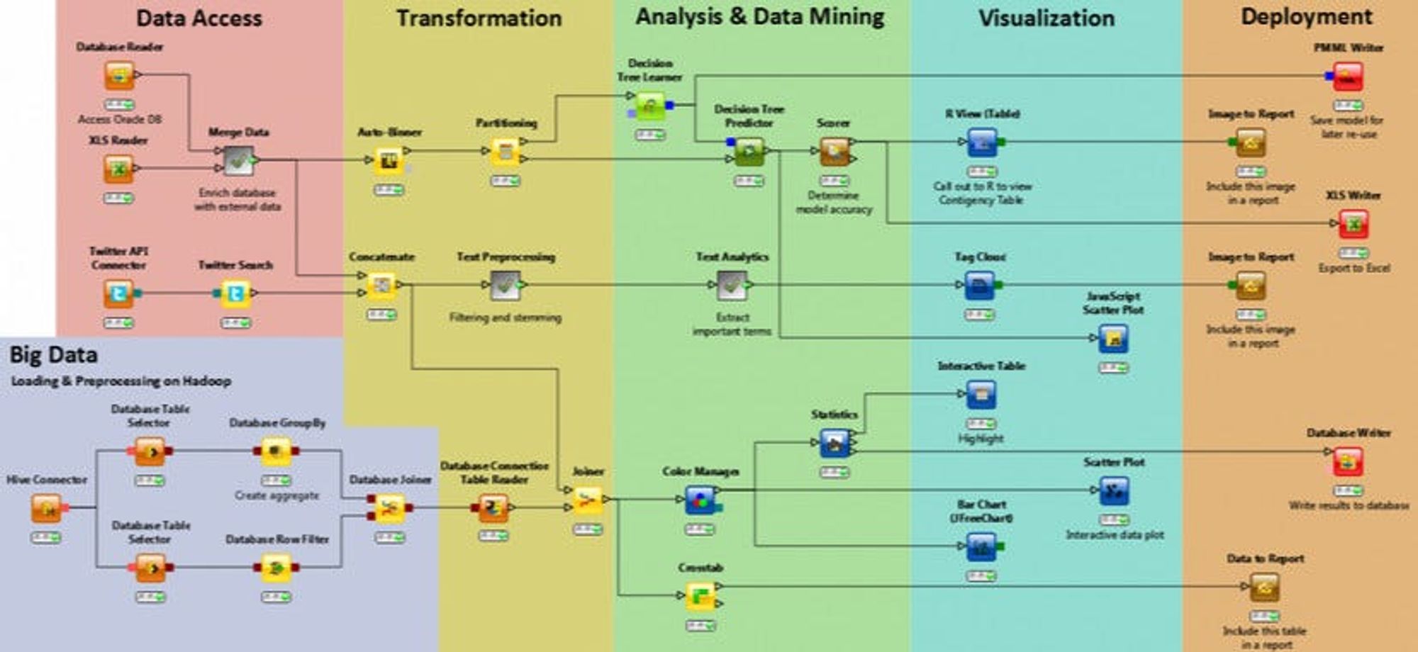
R — if you are new to programming, R may be a little easier to use and has similar functionality to Python. I recommend installing R Studio, this provides an easy to use interface. If you are interested in visualisations then install ggplot within R, one of the many packages that are available to users for free.
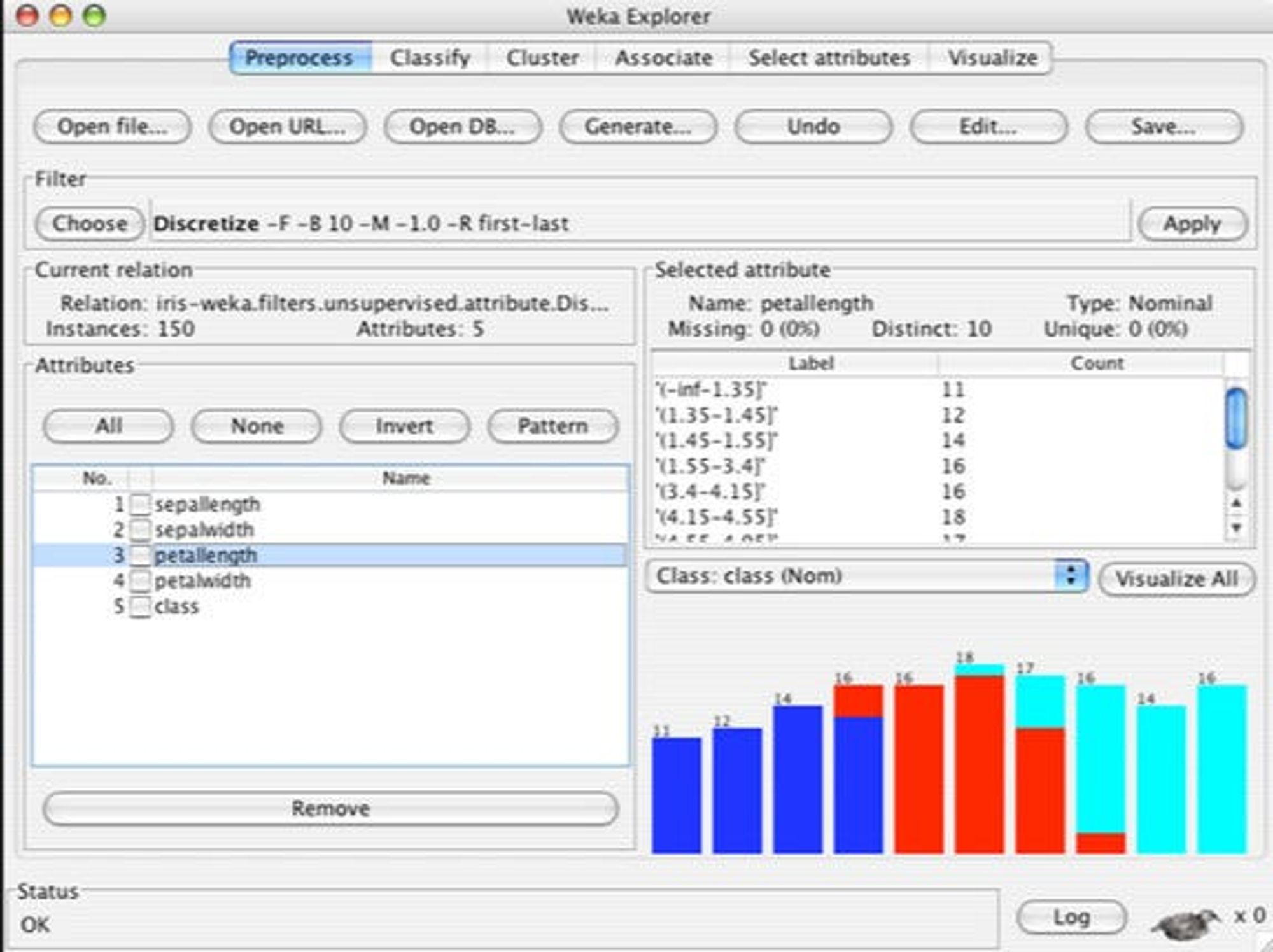
Weka — It seems all good things come out of NZ. This is another great data visualisation and machine learning tool. It is easy to use and has been great for me to quickly validate distributions and isolate where data integrity issues exist before shaping insights.
I hope you found this useful. I will be posting regularly so stay tuned. If you want additional content, check out Analytics Roundtable, to stay up to date with the latest technology and chat with others.

The High Cost of Employee Turnover
It has never been easier for employees to find new jobs. What is the cost of regretted turnover?

Ensuring value in the recruitment and new hire process
For HR professionals, there are many recruitment metrics, however, most do not provide the right value when measuring the effectiveness of the function